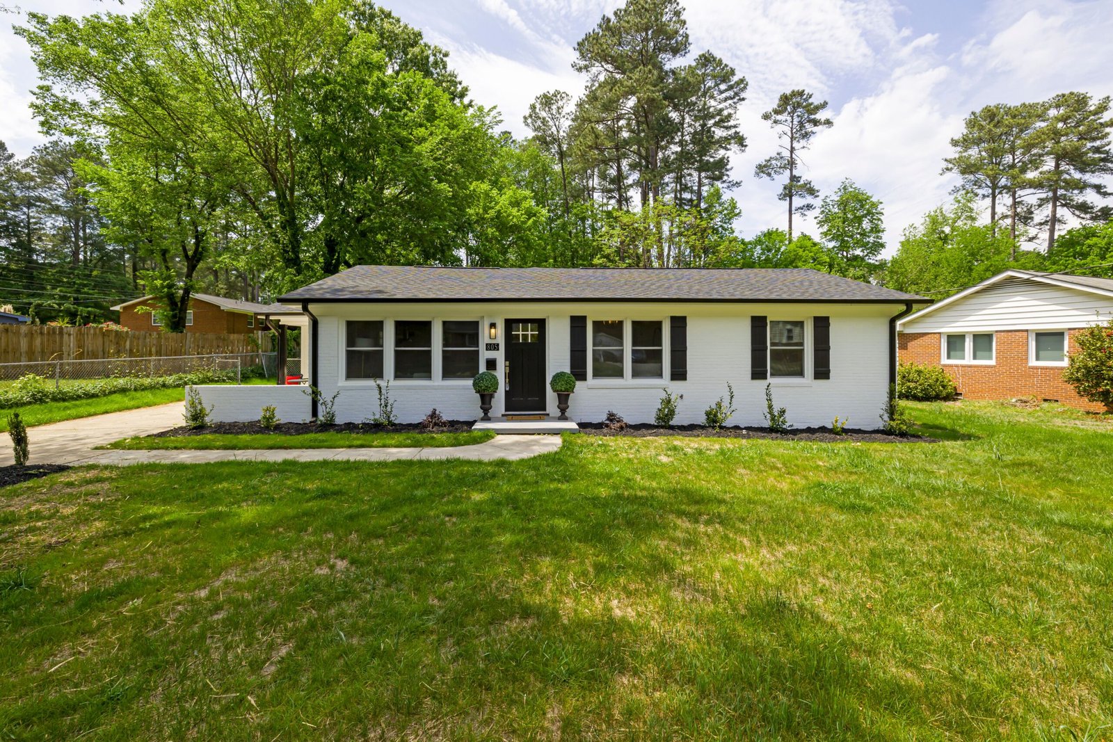
House Exterior Colors: How to Choose a Palette That Suits Your Home
House exterior colors work best when you choose them from the outside in: start with what you cannot change and let the rest follow. That order matters, because the roof, brick, stone, and even the driveway already set part of your palette. Choose colors that agree with those fixed parts, and the house looks settled. Fight them, and even an expensive paint job will look restless.
This guide gives you a simple method instead of a list of “must-have” colors. You will inventory your fixed elements, learn to read undertone, choose a body, trim, and accent with a plan, and test the result in real light. By the end, you will know exactly what to put on a paint store list, and why. For more ideas in the same area, browse Architecture & Exterior.
Start With What You Cannot Change
Paint is flexible. Roofs, brick, stone, and driveways are not. So let those parts lead.
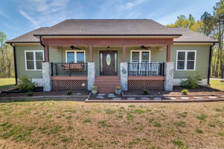
Walk around your house and note each fixed element: roof color and material, brick or stone color, window frame color, driveway and path material, and any feature the house is known for, such as a stone chimney or a tile roof. Take a photo of each in daylight. These notes become your inventory, and they stop you from choosing colors that fight what is already there. A guide to choosing exterior paint colors that match fixed elements covers the same first step: start with your roof and let the fixed materials lead.
The Fixed-First Inventory
Use this labeled example worksheet on your own home. The example house below is invented to show the method, not to suggest a palette for your house.
| Fixed element | Example house | What it tells you |
|---|---|---|
| Roof | Charcoal gray shingles | Cool, dark anchor; most body colors can work, but warm brick would need care |
| Brick | Warm red brick on the front wall | Warm undertone leads; cool gray body may clash |
| Stone | None | One less fixed color to match |
| Window frames | White vinyl, staying | Trim should relate to this white, not fight it |
| Driveway | Gray concrete | Cool, neutral; does not push the palette warm or cool |
| Verdict for the example | Warm brick + cool roof | Choose a warm-leaning neutral body, keep trim soft white, let the door carry color |
Notice the conflict in the example: a warm brick and a cool roof pull in different directions. The fix is a warm-leaning neutral body that can sit comfortably with both. If your own inventory shows a similar fight between two fixed parts, choose the body color that bridges them, not the one that matches only one side.
Why the roof leads the palette
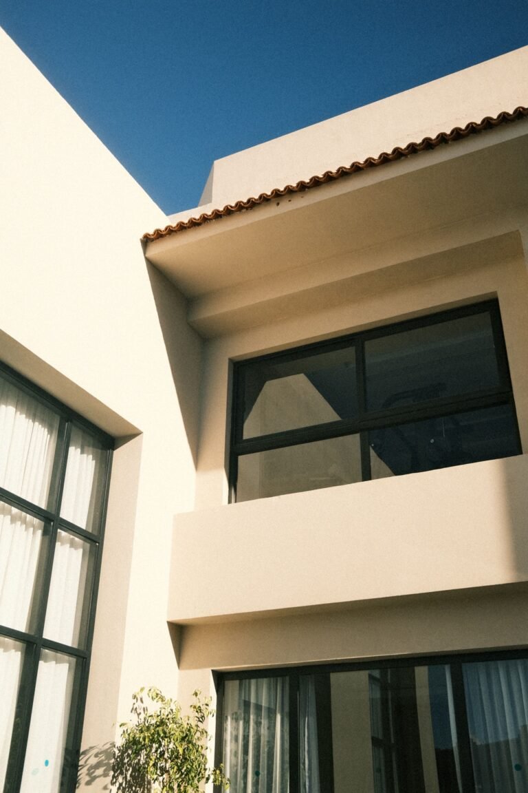
The roof covers a large part of what you see from the street, especially on a one- or two-story home. A brown or weathered-wood roof usually suits warm body colors. A black or charcoal roof works with a wide range, because it acts as a dark frame. A cool gray roof usually suits cool or neutral bodies. A red or terracotta tile roof asks for earthy, warm companions such as cream, sand, olive, or sage. Fighting your roof undertone is the fastest way to make a new paint job look unsettled.
Three Dials, Not One Choice
Choosing a color feels hard because it is really three decisions at once. Separate them, and each one becomes manageable.

Undertone: warm, cool, or leaning
Undertone is the quiet color hiding inside a “neutral.” A gray can lean blue, green, or purple. A white can lean yellow or pink. A beige can lean gold or rose. Hold your candidate next to your brick or stone, not next to another paint swatch. The fixed material will reveal the lean at once. A guide to choosing a roof color that matches fixed elements makes the same point: let brick, stone, and existing siding lead, and follow their undertones so nothing clashes.
Value: how light or dark
Value means lightness or darkness. Light bodies make a house look larger and brighter, and they show less fading in strong sun. Dark bodies look dramatic and grounded, but they can make a small house feel smaller, and they absorb more heat. In a hot, sunny climate, think twice before painting a large sun-facing wall very dark, and ask a local paint professional about heat and fading for your exposure.
Contrast: calm blend vs crisp edge
Contrast is the gap between body, trim, and accent. Low contrast — a body and trim only a few shades apart — feels calm and blended. High contrast — a light body with dark trim, or a dark body with bright white trim — feels crisp and architectural. Neither is right for every home. A highly detailed traditional home can handle more contrast because the trim has work to do. A plain modern facade often looks better with calmer contrast, so its form stays the focus.
Five Palette Families That Cover Most Homes
You do not need to invent a palette from scratch. Start with a family, then adjust it to your fixed elements.
Warm white and wood. A warm white body, soft white trim, and natural wood at the door or porch. This family feels bright without feeling stark, and it suits many styles, from cottage to modern.
Soft gray-greige. A gray-beige body that leans warm or cool to match your roof and brick, with trim a shade or two lighter. This is a forgiving family for homes with mixed materials, because greige can bridge warm brick and cool stone.
Sage and stone. A muted green-gray body with stone or warm trim. This family suits homes near trees and gardens, where green already surrounds the house. Keep the sage muted. A bright green body can quickly look like a costume.
Deep charcoal and light trim. A dark body with crisp light trim and a wood or bold door. This family looks striking on simple, modern forms. It needs good lighting and planting, or a dark house can disappear into shade.
Cream and earth tones. A cream or sand body, warm brown or bronze trim, and an earthy door color. This family suits brick, tile roofs, and warmer climates, where the palette echoes the landscape rather than fighting it.
None of these families is a prescription. They are starting points. Your roof, brick, and light still get the final vote.
Match the Palette to Your Roof and Brick
Here is a general pairing table. Treat it as a starting map, not a rulebook, and always test against your actual materials.
| Your fixed anchor | Body colors to try first | Trim direction |
|---|---|---|
| Brown or weathered-wood roof | Warm greige, khaki, sage, cream | Warm white or soft cream |
| Black or charcoal roof | Most neutrals, including white, gray, sage, and warm beige | Crisp white for contrast, or warm white for softness |
| Cool gray roof | Slate blue, dove gray, soft white, cool greige | Cool white or light gray |
| Red or terracotta tile roof | Cream, sand, olive, sage | Warm white or muted earth tones |
| Warm red brick | Warm putty gray, warm greige, cream | Warm white; avoid icy blue-white trim |
| Cool gray or blue stone | Cool gray, slate blue, soft white | Cool white or light gray |
When brick should lead: if brick covers a large part of the front, choose the body color to flatter the brick, not the other way around. Pull a tone from the brick itself, or from its mortar, and let the body sit quietly beside it. A brick front with a body color that fights it will look wrong from the street no matter how fashionable the body color is.
Also check your neighborhood and any homeowners association rules before you commit. Some areas limit body colors, trim colors, or bright accents. A quick check now saves a repaint later.
Trim and the Front Door Do Different Jobs
Beginners often give trim and the door the same job: “add color.” They work better apart.
Trim: define, don’t compete
Trim outlines windows, corners, fascia, and the roofline. Its job is to define the architecture. In most palettes, trim should be a lighter or darker version of the body family, not a new color idea. White trim is popular because it defines clearly, but the white matters: a warm white suits warm bodies, and a cool white suits cool bodies. An icy white next to warm brick can look harsh.
A planning ratio many guides use is 60-30-10: about 60 percent body, 30 percent trim, and 10 percent accent. One method guide explains this exterior color ratio as a way to keep the body calm and let the accent carry personality. Treat the numbers as a guide, not a measurement you must hit exactly. The idea is simple: body leads, trim supports, accent surprises in a small dose.
Door: the small bold move
The front door is your 10 percent. This is where a deeper blue, a muted green, a warm red, or natural wood can shine without overwhelming the house. Because the door is small, you can afford a color with more character here. Just keep it in the same warm or cool family as the rest of the palette. A cool navy door can work with a warm house if the trim and hardware bridge the gap, but a door that ignores the palette entirely will look pasted on.
Test Colors the Way Light Actually Works
This is the step most people skip, and the step that prevents the most regret.

Large samples, three lights, three days
Buy sample pots of your two or three finalists, not ten. Paint large swatches on boards you can move, or on a discrete part of the house if you prefer. Look at them in morning light, midday light, and evening shade. Check them on a sunny side and a shaded side. Check them next to your brick, stone, and roof, not in isolation.
Repeat for at least three days if you can. Light changes with weather, and a color that looks perfect on a bright Saturday can look dull on a cloudy Tuesday. This slow test costs little and saves a full repaint.
Check from the street
Step back to the curb. Colors look darker and stronger on a large wall than on a small board. A body color that looks pale in your hand may look just right on the whole house. A trim color that looks subtle up close may disappear from the street. Judge the whole composition — body, trim, door, roof, and planting together — before you approve it.
Also look at your neighbors’ houses. You do not need to copy them, but a palette that clashes loudly with every house on the street will draw attention for the wrong reason. A color that fits the street while still feeling like yours is usually the sweet spot.
Mistakes That Cause Repaint Regret
- Choosing from a tiny printed swatch indoors, under store lighting, without testing outdoors.
- Picking the body color first and discovering it fights the brick or roof afterward.
- Ignoring undertone, so a “neutral” gray turns green or purple on the wall.
- Making body, trim, and door all bold, so nothing rests and the house looks noisy.
- Using icy white trim with warm brick, or warm cream trim with cool stone, without checking them together in daylight.
- Painting a large sun-facing wall very dark without considering heat, fading, and upkeep.
- Skipping the HOA or local rule check until after the paint is bought.
- Testing only one small patch, in one light, on one side of the house.
If your home has lead paint, damaged siding, or peeling paint down to bare wood, get a qualified local professional to assess preparation and safety before you paint. Color choice matters, but preparation decides how long the color lasts.
Frequently Asked Questions
How do I pick a body color?
Start with your roof, brick, and stone. Find their undertones, then shortlist two or three body colors in the same warm or cool family. Test large samples outdoors before you commit.
What is the 60-30-10 rule?
It is a planning guide: about 60 percent body color, 30 percent trim, and 10 percent accent, such as the front door. It keeps the body calm and gives personality a small, controlled place to live.
What color goes with a red brick house?
Warm-leaning neutrals usually work best: warm greige, warm putty gray, or cream, with warm white trim. Let the brick lead, and avoid a body color that introduces a competing cool or pink undertone.
Should trim always be white?
No. White is common because it defines architecture clearly, but the right white depends on your palette. Warm bodies usually suit warm whites; cool bodies suit cooler whites. On some homes, a few shades darker or lighter than the body looks calmer and more refined than bright white.
How do I test colors before painting?
Paint large samples on movable boards. View them in morning, midday, and evening light, on sun and shade sides, next to your fixed materials, and from the street, over several days. Narrow to one body, one trim, and one door color before you buy full gallons.
Do dark colors fade faster?
Dark colors can show fading, chalking, and heat effects more visibly than light colors, especially on sun-facing walls. That does not rule them out, but it does mean you should ask a local paint professional about products and upkeep for your climate and exposure.
Choosing house exterior colors is less about finding a perfect shade and more about building a small system that agrees with your home. Inventory what cannot change, read its undertone, balance body, trim, and accent, and test in real light. When that system holds together from the street, the color will feel like it belonged there all along. To finish the picture around the house, see low maintenance landscaping ideas, and to see the palette on a single-level home, read about a contemporary ranch house.
Disclaimer This article is general design information, not advice for a specific home. Colors vary with light, materials, and climate. Check local and HOA rules, and consult a qualified professional for lead paint, damaged siding, or major exterior work.